Whenever any piece of work is completed you have to evaluate it thoroughly, that's what I'm going to do in regards to my Music Magazine.
In what ways does your media product use, develop or challenge forms and conventions of real media products?
In what ways does your media product use, develop or challenge forms and conventions of real media products?
When producing my music magazine, I had to take into account the development and challenging process, keeping this in mind my music magazine both used, developed and challenged the normal conventions and codes of stereotypical and existing music magazines.
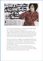
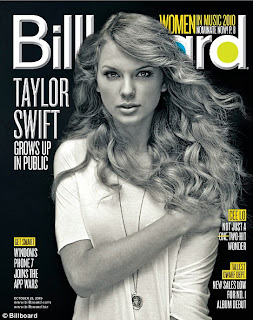
When deciding upon the logo for my music magazine, I previously looked at other magazines and analysed them. When designing my logo I wanted to make sure that it conformed to the expected normal codes and conventions. Well known music magazines don’t always have to go for the conventional BIG, BOLD header as they are already easily recognised – be that by the position in which the logo is placed, or the colours used.
As you can see from the image above, I decided to use a photograph for my front cover which is also is quite mainstream and conventional of any other.
My front cover contains an image that ‘lures’ the reader and catches their attention, after they have spotted the image their eyes can then divulge in the rest of the cover and the captions and headings around the page.
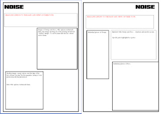
When producing my double page spread I took out a lot of research on other music magazines and their article pages.
On my double page spread I used colour, captions and images to lure my reader into the page and to catch their eye. In addition to this one double page spread I analysed, other examples of this also used the same technique to entice the reader.
I set the text on my double page spread in columns to keep with the conventions of other music magazines.
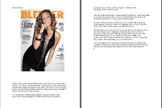
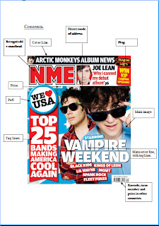
On my contents page, I analysed previous ones to try and get an idea of the sophistication and the layout of how I wanted mine to turn out and look. I featured to images and kept the conventions of any other music contents page.
How I developed them;
On the music magazines I have previously researched, I began to notice that most magazines only keep their brand identity and colours on the front colour, because my challenge was to develop my own music magazine, I felt that it was key to keep to this concept. I did however; make sure the Masthead was used on every article and the colour schemes of the contents page and double page spread were kept sophisticated and similar. I used black, white and red a lot on these two pages to keep a running connection, when it came to the front cover I used similar colours but also experimented and used others to stand out.
How it challenged them;
For the image I’ve chosen for my front cover, I decided to take a different approach to camera angles and vantage points. I wanted the reader and target audience to gain a sense of realism that they could relate to and not the stereotypical studio based photography.
Neither of the models (band members) are making eye contact in this scene, one person is looking far into the distance, which could symbolise him looking into his future, and the other artist is looking down, as if he’s thinking – but still keeping an ‘Indie’ vibe to the whole cover.
How does your media product represent particular social groups?
My Music magazine that I produced identifies and represents different social groups in a number of ways. When I first got my brief on this specific piece of coursework, I immediately thought of what type of audience I wanted to appeal to. From that I made a rough spider-diagram of how and who my magazine was going to appeal to.
As well as doing this I produced questionnaires and handed them out to the general public, then collected them back in and produced the results.
From the results I got back, I was then able to carry on with the development and design process of my magazine. My magazine is completely representative of a specific teenage “stereotype” of the ‘Indie’ genre. The name of the magazine ‘NOISE’ came from the positive feedback and input from the public. The connotations of the Masthead ‘NOISE’ are representative of teenagers, as other generations class them as being noisy, disruptive and annoying. I feel that this was the right name for the magazine, as it can target a whole target of people and large scale social groups.
The magazine it’s targeted at people between the ages of 16-21, therefore I then had to come up with a representative and reasonable price to benefit everyone. The first issue price was at a discounted 99p but from then on, it would be £2 which seems quite an adequate price – the public agreed. The target audience for this magazine are not only interested in bands, but also in festival news and lines up, tours and gigs and band news. I thought that it was necessary was to ask these questions and gain results. – These pages could then be used on the contents page.
I felt that from the feedback, most of the readers would have been mainly male; they wanted to know about the festivals, whilst the females wanted specific interviews and gossip.
What kind of media institution might distribute your media product and why?
The media institutions that might distribute my magazines range from one to many.
First of all the magazine would have been sent to a publishing house who would then have an array of contacts ranging from high street shops to the music industry. A publisher has a multi-faceted company, allowing it to promote products to more than one retailer.
Having magazines distributed via high streets would be the most common, easiest, cheapest and fastest way of doing so. Millions of people every day by magazines from shops and newsstands. As well as this approach the publisher can send copies to music industry clients, having them promoted and displayed in their offices and boardrooms. Having magazines on high-mail order via the internet, allowing people who don’t always have the time to go out and purchase the magazine, they are available to order or download a copy online. This then benefits the reader as it can work around their life, they feel this is a plus and keep coming back to use this service.
Who would be the audience for your media product?
As previously stated I undertook a lot of previous research into gaining the exact and right information that would help along the development of my music magazine. From the results, the target audience for my magazine were students from the age range of 16-21, of both genders – with a lead in males. I kept the colour schemes sophisticated and equal so one gender didn’t feel embarrassed or ashamed to purchase the magazine.
On the contents page, there was a list of articles that would have been included in the magazine, these featured Interviews – with the band members featured on the front page, Festival News, Gigs and “new artist” reviews, tour dates and locations and fashion trends. – All of these subjects had been suggested in the questionnaires previously asked.
Among these teenagers, their interests would have been similar, so it would be ‘easy’ to try and relate to everyone, by including a variety of subjects and different bands most people associated with this particular genre of music would be interested in knowing about.
At the age of the teenagers that the magazine is aimed at, most of them have jobs so are earning a bit of extra cash and are able to support themselves financially whilst possibly still living at home, so they have a bit more of a disposable income per month than others, so they are able to spend it on materialistic items such as magazines, gig tickets, merchandise etc.
How did you attract/address your audience? How did audience feedback help you to make important decisions?
In order to attract my target audience I thought it was important to have a good and bold front cover to catch their eye. To do this, I used a large, bold and interesting image on the front cover, that’d stop and make people look in greater detail. I think the fact that I kept the fonts and lures simple helped attract my audience. Having a bold, white Masthead which “jumps” out of the image is a key component in attracting audiences. I think the overall layout and colour scheme gives a sophisticated, cool and up-to-date atmosphere. With the use of a smaller image on the front, I think benefited the overall appearance as it gives the reader an insight as to what’s included in the magazine, and the genre of it. Even though there is text present on the page, there isn’t so much that it spoils and takes the background image away from focus.
I tried to continue with this concept throughout the project. With my double page spreads, I tried to keep the colour schemes and layout simple and not to over complicate things for the reader. I did use different colours within the interview and for quotes to make it clear as to who was who and to bring a bit of colour to the page but still keep within the conventional boundaries.
For the Contents page, I kept the layout simple again and used the same colour scheme of black, white and red to keep a running connection going. This also keeps it equal between the genders if the colours are neutral.
For the Contents page, I kept the layout simple again and used the same colour scheme of black, white and red to keep a running connection going. This also keeps it equal between the genders if the colours are neutral.
The audience’s feedback via the questionnaires helped greatly as I was able to take their comments and put them towards producing and editing my magazine so it could be the best and could relate exactly to what the reader and target audience wanted.
What have you learnt about technologies from the process of constructing this product?
From constructing this product I felt that I have learnt a lot as well as expanding on my previous knowledge. As well as being a Media student, I am also a Photography student, so I have a pretty good idea on all the different things Photoshop enables you to do and what you can create from it. I dint want to be seen and “too keen” whilst using it, and overcomplicate the image so I stuck to the basics which I still felt was enough.
With the use of Photoshop I was able to manipulate images even if it was by using simple techniques such as the burn and dodge tool, which allow you to darken and lighten certain parts of an image.
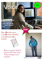
As you can see from the bottom image, I manipulated it for it fit in with the theme of the magazine, and to give an indie vibe to the overall piece. I now feel as if I've widened my knowledge on photoshop even more, and this can then benefit all my other aspects of work.
Looking back at your preliminary task, what do you feel you have learnt in the progression from it to the full product?
Overall, going back to the beginning of my blog and looking over my pre-lim task and my final product, I feel more comfortable with the language used and the programmes. Even though I had a pretty good knowledge of Photoshop, I think I’ve extended that even more now, even on the simplest of forms. Most importantly, I think I’ve extended my use of terminology and noticing the codes and conventions of music magazines already available out there on the market. I feel by every analysis I done, helped progress a little bit more and gain more of knowledge on the music industry. With all photographs taken, I am impressed with the end product, but if I had to reproduce this front cover, I’d probably change the way it was photographed and the area. I think the fact that you are around people in your class who are doing the same work as you, and are including in the actual production of your work, be it via imaging for the front cover, interviewing or questionnaires benefits you and helps to motivate you to get everything completed on time. All in all I feel that I have learnt a lot in this process, mainly on my language and terminology front, but massively benefited from the Photoshop work too.

